House of Chelsea B • Chicago, IllinoisA Vibe, Not a Trend
01 BRAND STRATEGY02 BRAND IDENTITY03 PAckaging design04 WEB DESIGN05 shopify DEVELOPMENTHouse of Chelsea B is a brand that takes up space in different planes of art and culture, telling a story through each unique design.
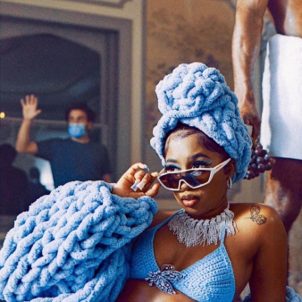
The crochet studio, led by Chelsea Billingsley brings a new perspective in both the fiber and fashion community. Her goal: to push the boundaries of textile fashion.
When Chelsea came to us in 2023, she was looking to refresh her brand and website to match her cutting-edge style. She brought us in to help retell her story through visuals—carefully crafting a balance between design, creativity, and technique.
From the color, to the texture, shapes, and the sharp type that resembles Chelsea’s personality, we crafted a bold and daring brand identity, packaging suite, and website.
Fashion Meets Emotion
When digging into the House of Chelsea B personality, we found that Chelsea’s work meets at the intersection of fashion and emotion. She doesn’t just create wearable pieces, she creates vibes, where each piece has their own personality, tells a story, and allows a wearer to express themselves uniquely and passionately.
Her brand is daring — taking up space in the different lanes of art and culture, telling a story through each unique design and inspiring — pushing the boundaries of textile fashion.
It’s spirited — taking a playful approach to design and creativity and striking – unlike any others beause of the create elements that capture the attention of her audiences. From these key personality features we sought to create a brand identity and presence that accurately represented this.
The result: bold, edgy, and boundary pushing designs.
THE DESIGN MOODBOARDDARING
INSPIRING
SPIRITED
STRIKING
BOLD
DARING INSPIRING SPIRITED STRIKING BOLD
Bold Stitches,
Bright Hues
As we designed House of Chelsea B’s brand identity, we wanted to weave a unique tapestry through the whole design system.
Beginning with the logo, we sought to keep the clear symbolism of the crochet hook. Rather than using it as an “add-on” icon, we incorporated it into the wordmark and monogram: bridging Chelsea/B where there is a natural break in the logo. The font selected for the logo was chosen because of its stature mixed with soft billowing of the letters, a nod to the curves of yarn and weaving elements together.
Our color palette was inspired by the bright colorways that Chelsea often uses in her works. The combinations of the vivid and intensity make them stand out prominently and create a sense of confidence and impact. The colors are used in their pure, saturated forms.
Floral-Inspired Shapes
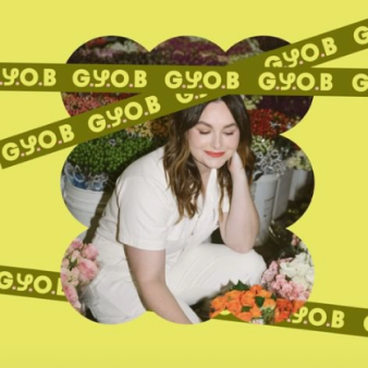
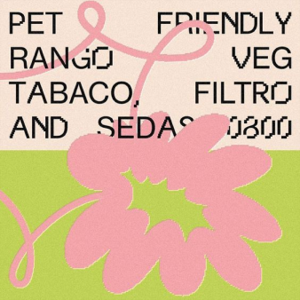
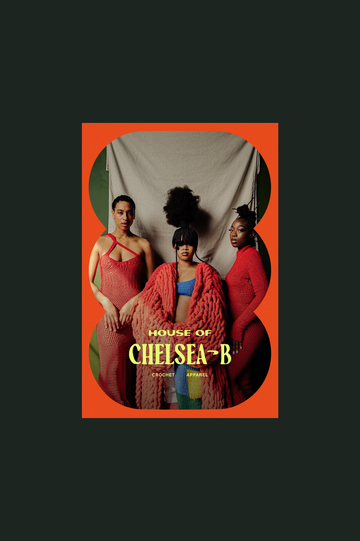
Chelsea’s work often is inspired by nature’s florals (for example: her last fashion show Give Them Their Flowers), so it was only natural to incorporate them into the brand design. As we began exploring, we found synergy between flowers and the pillowing of yarn balls. Hence: shapes that live in between both. In addition, we translated these shaped into unique windows to symbolize the looking-through and capturing moments of each of her pieces. The shapes give each item a moment to shine and be focused on.
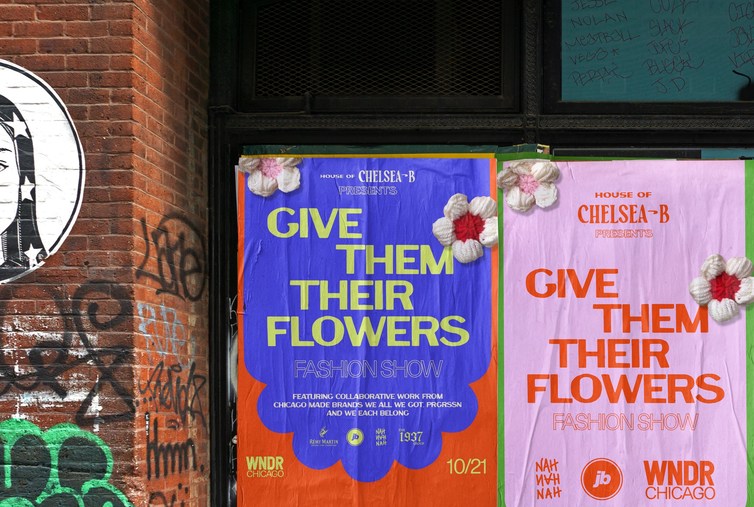
Give Them Their Flowers
One month after the branding hand-off, the House of Chelsea B team took their assets and guidelines to create the poster and advertising for their upcoming Fashion Show, Give Them Their Flowers. We wanted to showcase this because they utilized the brand perfectly in all their materials, and we are so proud!
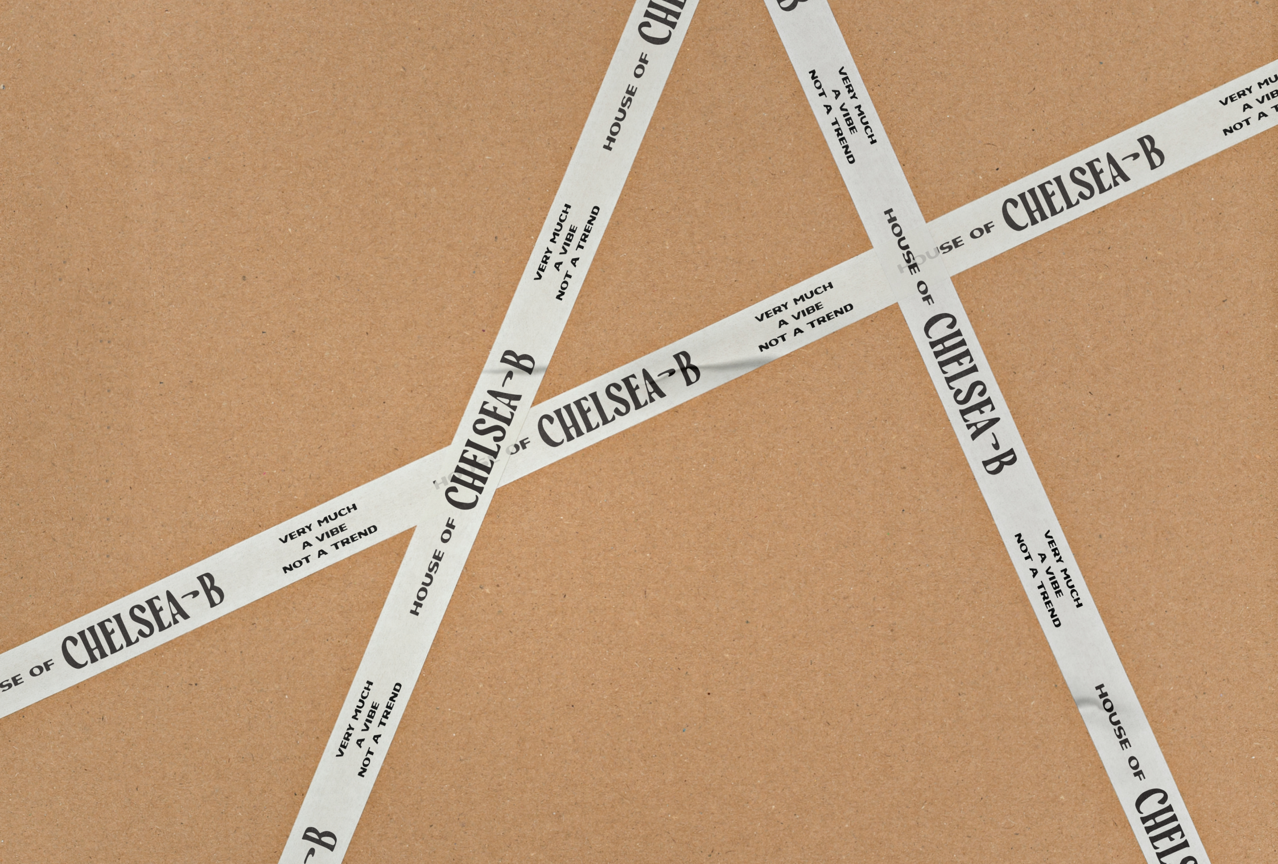
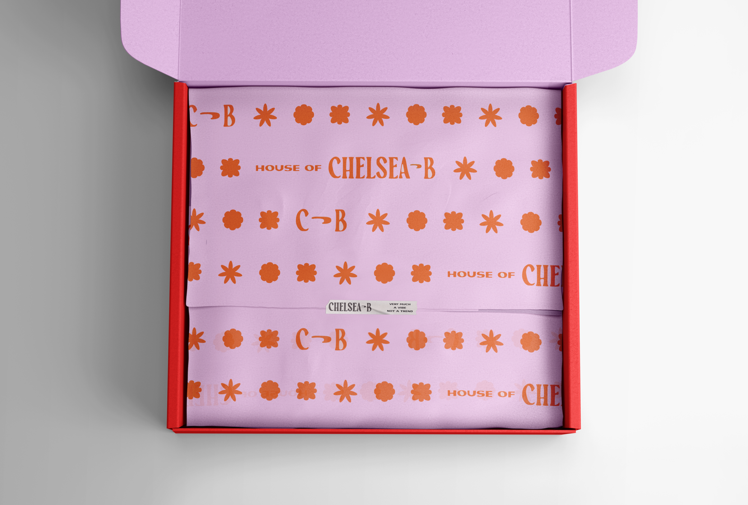
Packaging
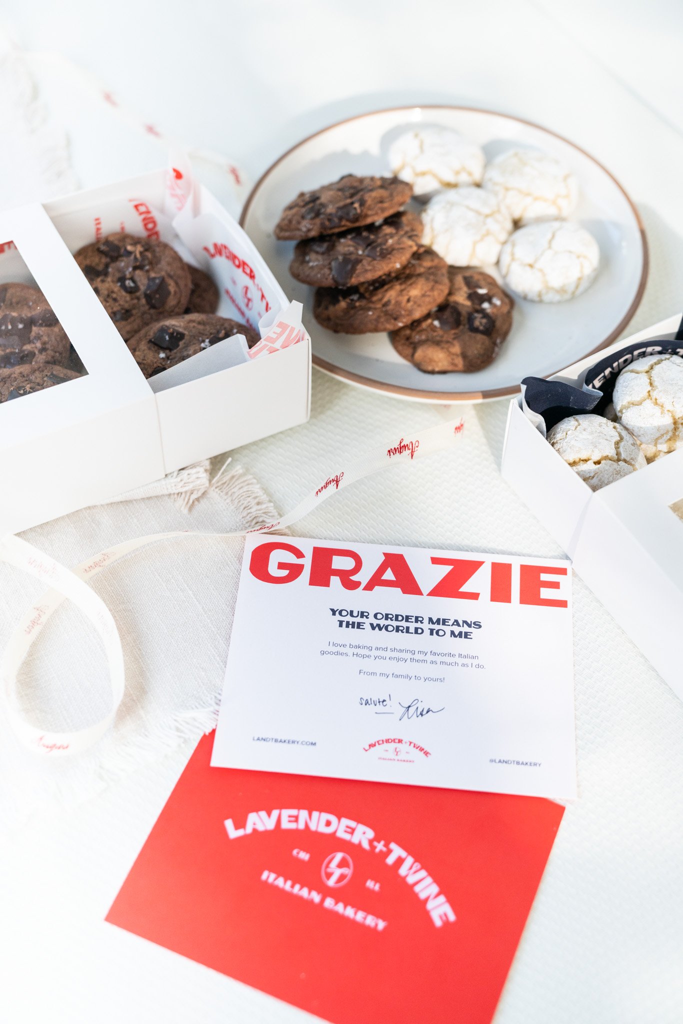
Through each packaging touchpoint (polybags, shipping box, tissue paper, thank you/care card, washi tape, and more) we mixed and matched the vibrant colors and fun shapes to create layouts that bleed across areas to weave a unique unpacking experience.
A Boundary-Pushing Shopping Experience
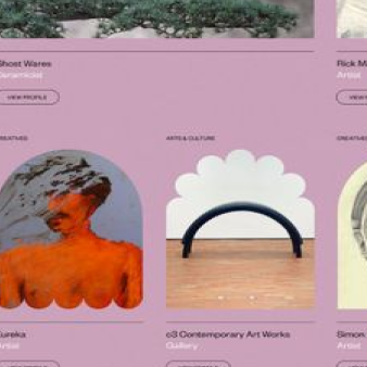
When crafting House of Chelsea B’s digital Shopify website, we wanted to bring all the elements of the brand’s personality to the site - and make it anything but a dull shopping experience. The goal was to have the site be a mirror of the experience one gets when seeing Chelsea’s pieces on the runway, in a music video, in a feature photo, or on their doorstep ready to be worn. It needed excitement, interactivity and a bold and vibrant exterior. We colored outside the lines with unique hover shapes, a custom cursor, and an experimental grid layout.
The site pushes the boundaries of a traditional eCommerce website’s experience, and helps change the narrative that crochet is stuffy, old, or boring.
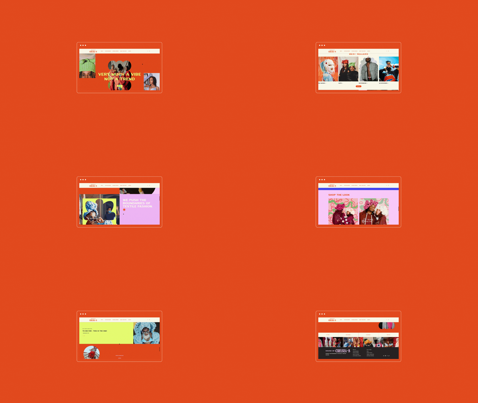
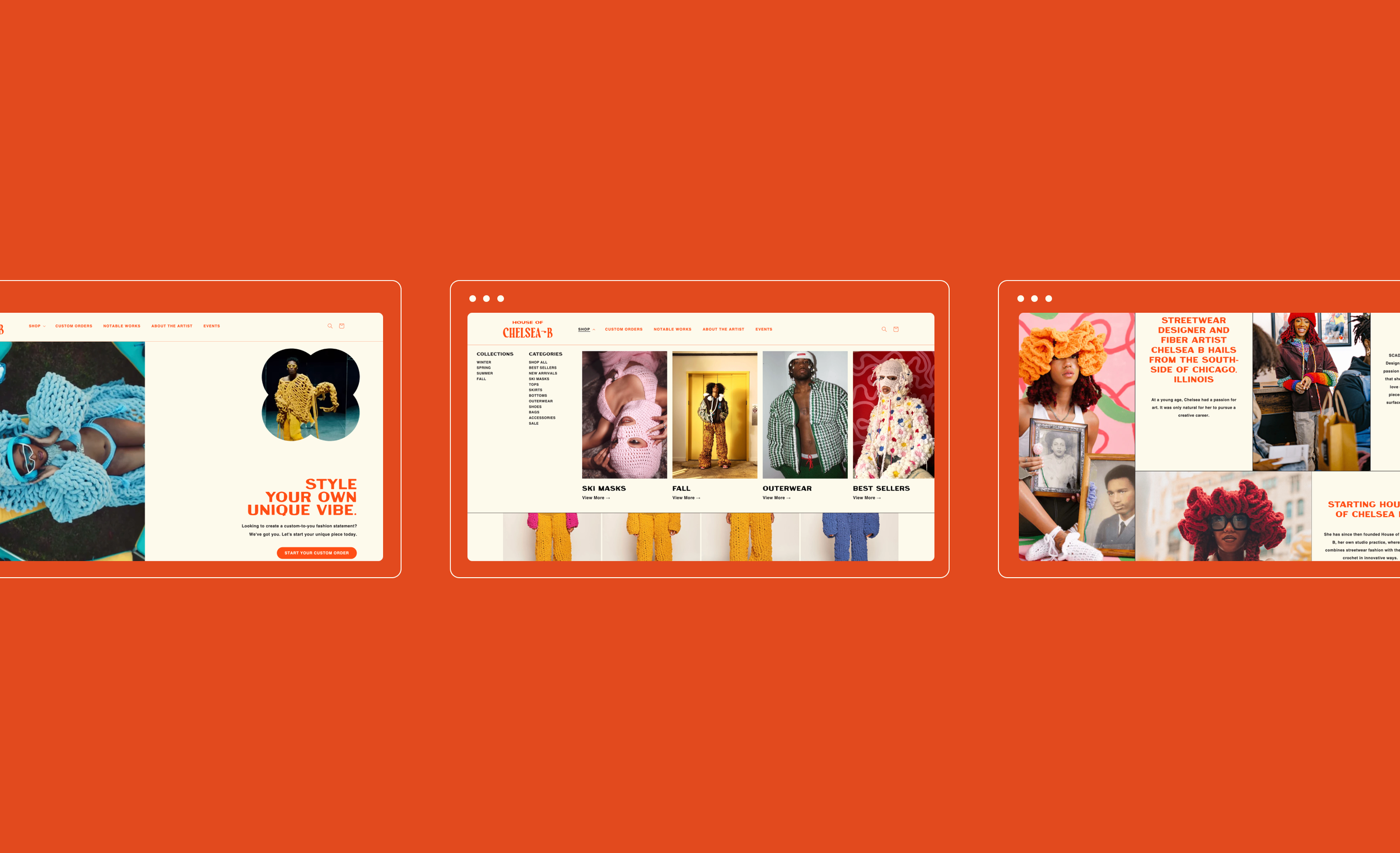
Hover below to scroll through the website.
WHAT THEY SAID“With the help of Sereth Design, I’ve been able to bring my vision to life. I could not thank you all enough for laboring with me day in and day out on this project. You all truly listened to my heart. What a dream it has been.”
— Chelsea Billingsley • House of Chelsea B • Chicago, Illinois


