INTI THE LABEL • Santa barbara, CaliforniaThe Future of Fashion is Gender-Neutral
01 BRAND STRATEGY02 BRAND IDENTITY03 PAckaging design04 SOCIAL MEDIAInti The Label, a specialty children’s clothing brand, is the destination for gender-neutral apparel that features mix-and-match for parents looking for peace of mind, ease of dressing, and time back to spend with their ever-growing babies.
In 2023, the founder Delma reached out to Sereth Design to help refine their brand. We focused and aligned their strategic message and guided the growth direction with a clear core beliefs, marketing approaches, and a design system that ties it all together.

Apparel for
All Children
As we dug into the strategy, we found a few challenges. Inti The Label was speaking to everyone, but no one. We had an opportunity to really refine our audience and get clear on what energy needed to be brought into the branding. A big part of this was defining the what (product offerings), the how (the shopping experience) and the why (the emotional impact).
This paved way for the goals we wanted to achieve through design: to educate the value in gender neutrality and encourage individuality and inclusivity in all children.
THE DESIGN MOODBOARD
TIMELESS
EXPRESSIVE
VERSATILE
CHARMING
CONFIDENT
PLAYFUL
TIMELESS EXPRESSIVE VERSATILE CHARMING CONFIDENT PLAYFUL
Exuberantly Stylish, Quietly Confident
People expect brands to have a personality, so they actually feel like they’re engaging with a person when they’re really engaging with a brand. We found Inti The Label’s personality to be fun + playful, inviting + charming, and humble to the core.
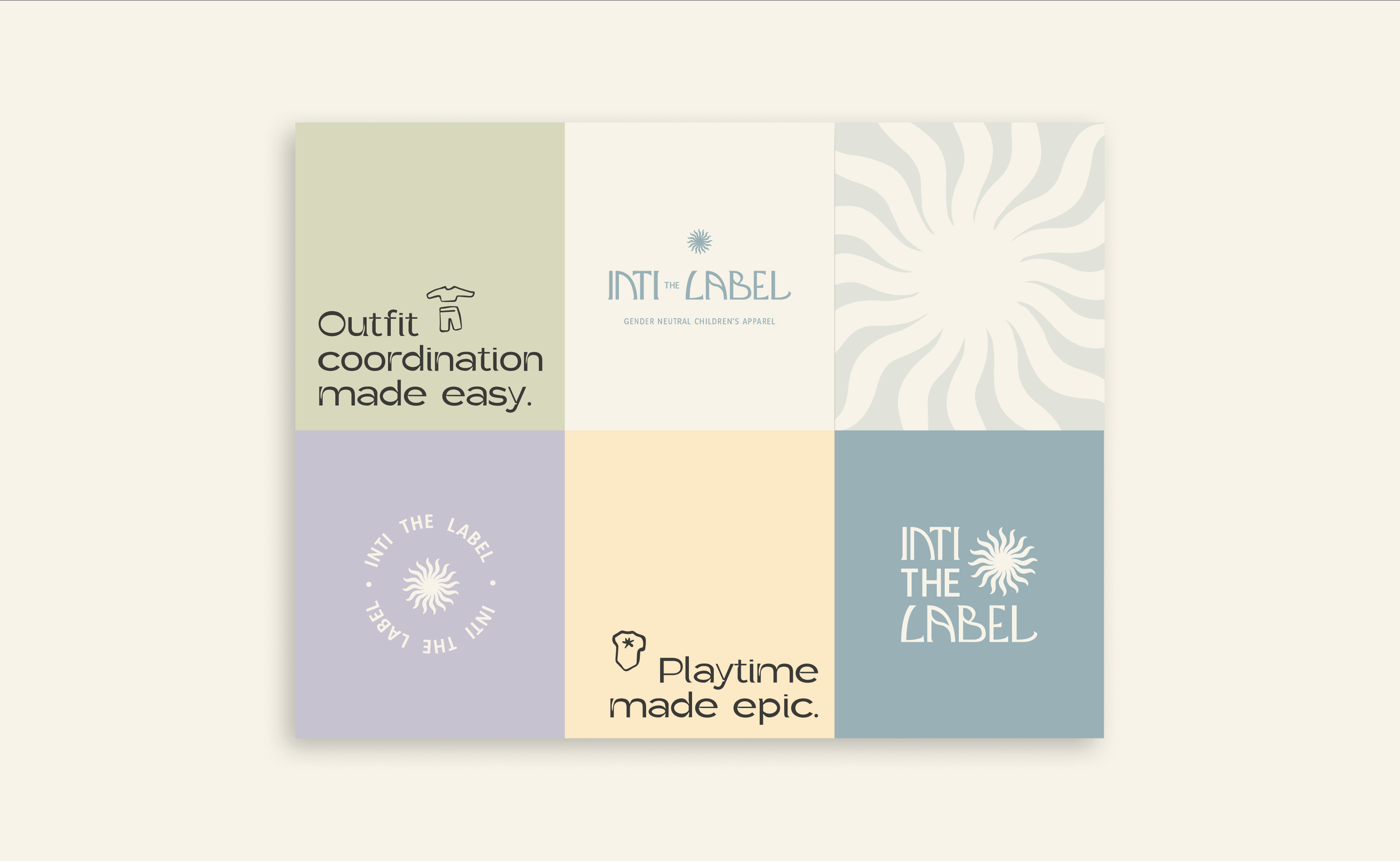
Through the logo itself we wanted to bring in this charm through unique letter forms, soft curvatures in the type showcasing the playfulness, and a clean and modern look that didn’t feel too masculine or feminine.
In the logo, we find the sun icon to tie the ‘Inti’ (the Incan Sun God) in. The waves on the sun also resemble waving limbs as children play together. In the wordmark, masculine sharpness of the feet contrast the feminine curves in the letters (see: the ‘B’ which resembles a pregnant belly). Each letter of the mark is crafted unique so none look like eachother, making each letter feel like siblings but part of the same family.


Blossoming Spring and
Sun-Kissed Summer
The color palette crafted draws inspiration from the brightness, refreshment, and joy that comes with a spring and summer day as the family plays the days away. The blue and yellows tying into the sun/sky, and the green and purple grounding it to nature. The pastel shades invoke a sense of liveliness, warmth, and freedom.
As we were looking to have the palette feel neutral, yet still vibrant, we created additional shades for each that melt into the darker versions of the color. This allowed for versatility in the color system, and a mix-and-match experience just like the clothing itself.

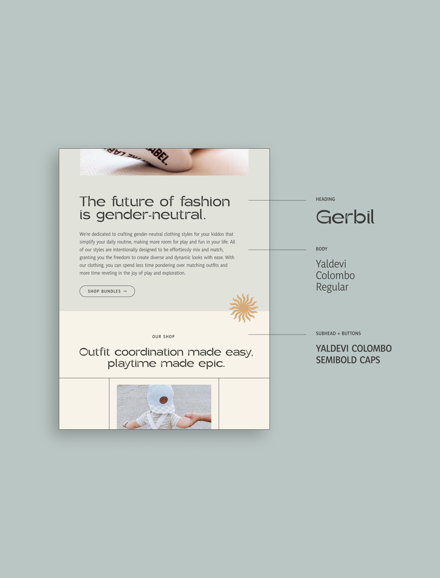

The heading font we chose is a modern-yet-unique font that is playful, expressive and confident. This font was chosen because it had aspects that paired well with the brand logo: soft curves, unique letters, and pairs the structure and confidence of a traditional san-serif font with the personality of a warm children’s brand.
The body font was chosen because it’s height brings stature to the brand. It also contains softs curves that bring the elements together. The two fonts pair beautifully to craft a strong system.
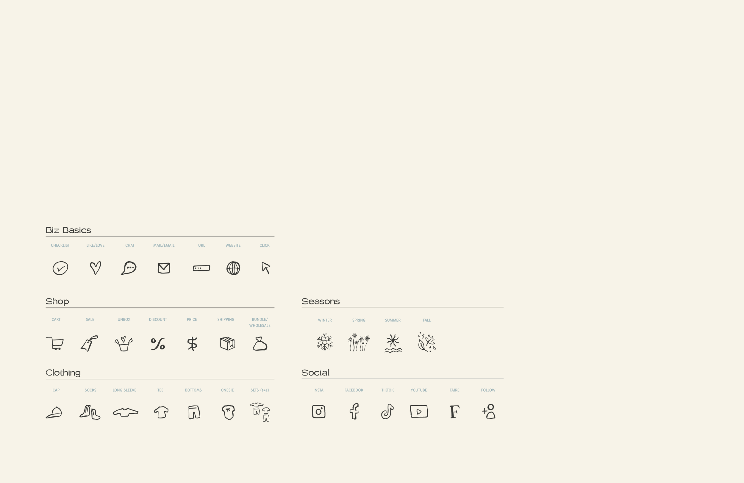
Iconography
We curated a family of icons that contribute to the brand identity and add to the versatility of brand communications. The icons were designed in a hand-drawn, playful style. We incorporated curves similar to the curves in the sun icon to tie the branding together.
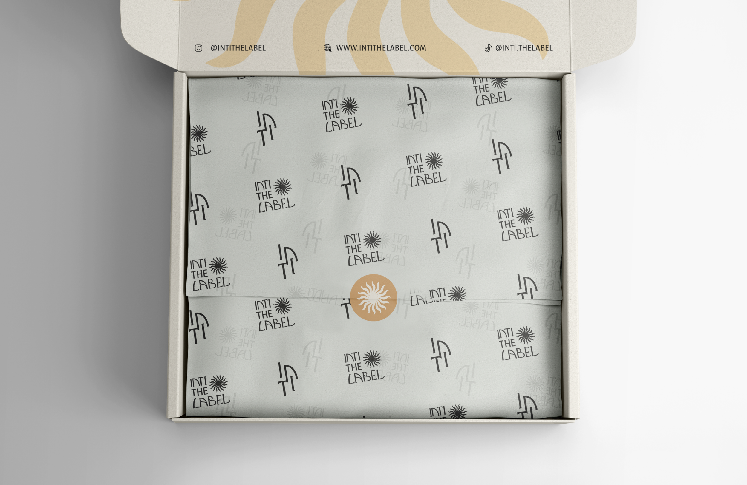
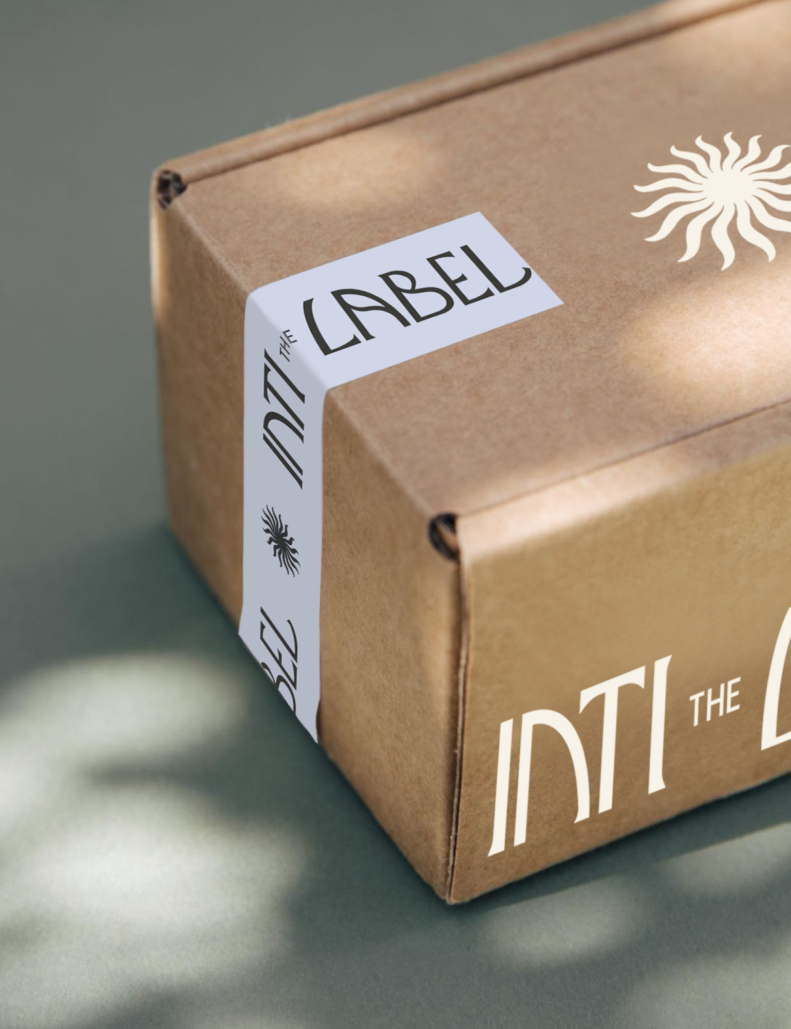
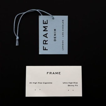
Packaging Joy in Every Order

With the brand elements in tow, we crafted unique and striking layouts that manifest Inti The Label’s presence through packaging, clothing tags, print, and digital.


Brightening the Screens

We created a collection of social media templates, profile skins, and digital assets that bring consistency to the Inti The Label brand. With each design, we wanted to exude ITL’s presence and personality: fun, playful, charming, stylish, and confident. These templates allow the brand to continue to grow and expand by seeing layouts that can be used in multiple sizes and formats.

WHAT THEY SAID“I can’t believe it. It’s pretty crazy to finally have an established, brand identity and voice that feels like ME. I have tears of joy, just feeling so emotional about what this new brand is going to bring for me and my family.”
— Delma Silva • Inti The Label • Santa Barbara, California